
I've recently posted on LinkedIn about the pattern to expose Lightning Web Component styles for modification and fine-tuning.
I've raised a topic that most of the time, when developers need to support particular styles, they do it via web component props.
For example, suppose you would like to support different background colors, border radii, and whatnot.
In that case, developers tend to create a component property for each and add extra logic in the component's controller to toggle the styles accordingly.
There are a few problems with that approach:
- What if you need to handle many properties?
- What if you need to support many different values?
- What if you want to allow developers to provide whatever value they want?
Consider this example.
import { LightningElement, api } from 'lwc';

export default class ProgressBar extends LightningElement {
  @api barColor = 'green'; // 'green' | 'blue'
  @api backgroundColor = 'white';

  get classes() {
    return `progress-bar progress-bar--color-${this.barColor}`;
  }

  get styles() {
    return `background-color: ${this.backgroundColor}`;
  }
}
<template>
  <div class={classes} styles={styles}><div>
</template>
.progress-bar--c-green {
  color: green;
}
.progress-bar--c-blue {
  color: blue;
}
The given approach makes components bloated and hard to maintain.
We also want to ensure the scalability and reusability as much as possible.
I suggest simplifying the implementation by exposing the custom CSS properties for parent components to control.
It's the approach that Salesforce uses in the Salesforce Lightning Component Library.
In this post, I describe how you can use that pattern and provide some examples.
Shadow vs. Light DOM
Why do we even need to bother implementing such a workaround with either component or CSS properties?
The problem lies in the shadow DOM that is enabled for Lightning Web Components by default.
Note: You can use light DOM with LWC, e.g., to support third-party libraries and have complete control over the DOM. However, it has its own pros and cons.
The shadow DOM allows us to encapsulate a component's CSS and JavaScript, just as an iframe does.
In practice, this means you cannot pierce it or modify the encapsulated styles.
Note: You can pierce the shadow DOM in JavaScript from a child to a parent component via events by using the composed and bubbles properties. If set to true, it will propagate across the shadow DOM boundary into the standard DOM and bubble up through the DOM tree. It's helpful in certain circumstances, but it deserves its own post.
If the shadow DOM is the root cause, why can't we use the light DOM and allow parent components to control styles directly?
The answer is that it has downsides, and we want to encapsulate the components to ensure we can reuse them across different layouts without worrying about them being overwritten.
In short, it gives more control and makes them more reliable.
I can give an example from my experience working at a large bank, where I helped maintain the shared component library.
We used the light DOM by default because there have been challenges with the dark theme in the applications.
The library has been used across all banking units in multiple countries, both for web and mobile applications.
One particular use case involved a text input component with a limited maximum width.
Since we could overwrite its CSS directly, some feature teams did precisely that.
In some applications, they wanted a full-width search bar input.
Because the out-of-the-box component didn't support that, it was too easy for them to add CSS styles and update them directly.
Some teams went crazy with those modifications, and the core team was unaware of them.
When we updated the component template and classes, you can imagine what happened to these apps.
It broke their UI layouts because none of their old CSS selectors worked.
It becomes essential in large organizations because you want to be able to release features independently, and fixing such problems affects the teams' planned work and requires resources.
The outcome and lesson from this are that we don't want to expose everything and allow side effects on components.
Instead, we want an encapsulated component with a specific API that exposes component attributes for controlling behavior and CSS properties for controlling styles.
Custom CSS Properties
What are those custom CSS properties, or CSS variables, and how to use them?
If you worked with the Lightning Component Library, you might've already used those.
The primary guideline from Salesforce is that you shouldn't edit component styling directly (as in my example from the previous section), but instead use design tokens.
Unfortunately, it's not perfectly documented which properties you can use per component, but consider a base icon component.
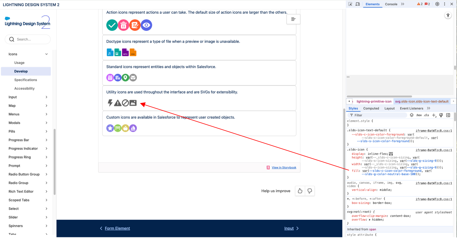
You can notice in its styles that it uses custom variables to control its SVG fill property.
.slds-icon {
	fill: var(--slds-c-icon-color-foreground, var(--slds-g-color-neutral-base-100));
}
The given rule means to use the --slds-c-icon-color-foreground variable and have a --slds-g-color-neutral-base-100 variable as a fallback if the first one is not set.
On the line above, you can see this.
.slds-icon-text-default {
	--slds-c-icon-color-foreground: var(--slds-c-icon-color-foreground-default, var(--slds-s-icon-color-foreground));
}
It sets the value to the foreground variable used by the icon itself.
Note that the --slds-c-icon-color-foreground-default is grayed out on the screenshot. It's because it has no default value.
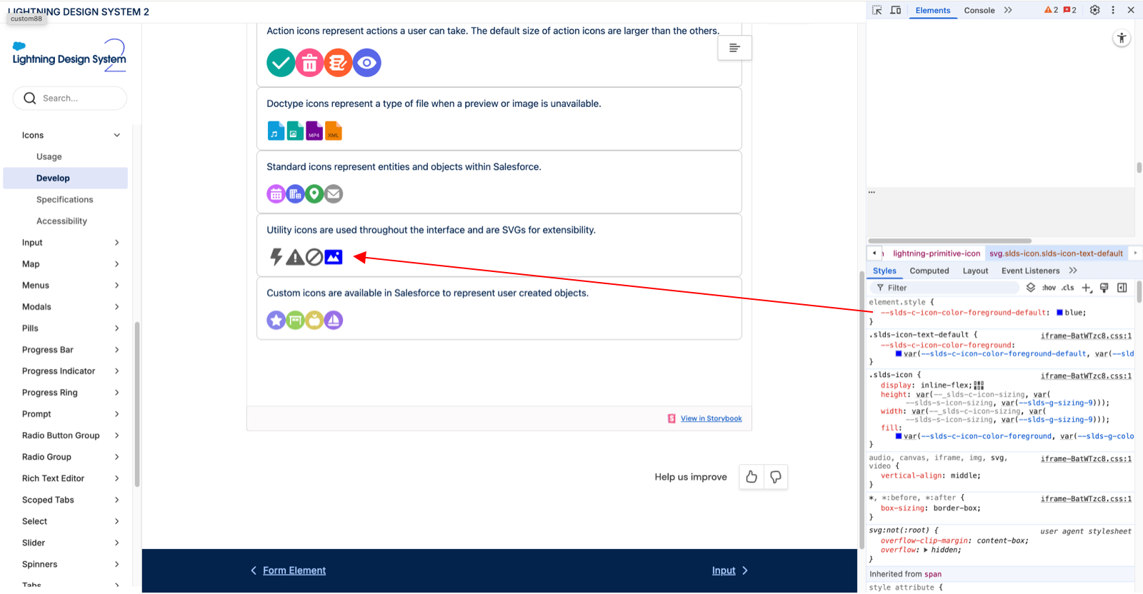
Consider this: if I update that variable and set the --slds-c-icon-color-foreground-default to blue, then the fill color becomes blue on the component.
It's a way to control the encapsulated component styles without using the global CSS styles with precise selectors.
The usage and implementation are straightforward.
- In the component that exposes the styles, create a public CSS variable without a value and use the default value as a fallback.
- In the parent component, you set the public CSS variable, and the child component will automatically pick it up.
Let's see it in action now!
Example: Custom Progress Bar Component
There are many examples I could come up with, but I picked a real-world one that demonstrates the idea.
Consider the use case:
You want to implement a usage component as a progress bar.
It's based on the standard Salesforce Lightning progress bar component.
But it's a customer-facing application, and you want to meet the design guidelines, so you need to update the styling.
Moreover, the component can be used in various layouts with different background colors, so developers should be able to adjust the progress bar background to match the requirements.
We want to make it flexible so that when a new team comes up with a new background color requirement, we do not need to update the base component.
How can we approach it?
Let's create a base component that uses the lightning-progress-bar and adds extra elements to the template.
import { LightningElement, api } from 'lwc';

export default class ProgressBar extends LightningElement {
  @api title;
  @api helptext;
  @api valueNow = 0;
  @api valueMax = 100;

  get value() {
    return (parseFloat(this.valueNow) / parseFloat(this.valueMax)) * 100 || 0;
  }
}
<template>
  <p>
    {title}
    <c-fds-tooltip lwc:if={helptext} position="top">
      {helptext}
    </c-fds-tooltip>
  </p>
  <lightning-progress-bar
    value={value}
    size="large"
    variant="circular"
  ></lightning-progress-bar>
</template>
The requirements now state that the component should support different background colors.
The challenge is ensuring the contrast requirement.
For example, you cannot have the same progress bar and component background, e.g., a white bar on a white background.
The property that controls the lightning-progress-bar background colors is named --lwc-progressBarColorBackground.
So, we need to set that variable.
As discussed earlier, the initial value should be an unset variable with a descriptive name, because that's the custom property we want to expose, and it should include a fallback value.
:host {
  --lwc-progressBarColorBackground: var(--progress-bar-background, #ffffff);
}
It sets the progress bar background color to white, while allowing developers to override it via the --progress-bar-background custom property.
Then, let's say a team wants to use that component on a white background and needs to change the progress bar's background color.
Now, they can do it by simply setting any color value to the variable.
  <template>
    <c-progress-bar title="Health insurance" value-now="1500" value-max="2500"></c-progress-bar>
  </template>
:host {
  --progress-bar-background: #dddddd;
}
As a result, the base component will render #dddddd background color instead of #ffffff.
Using this approach, you don't need to create extra component attributes, CSS classes, or dynamic inline styles, which is a bad practice.
Conclusion
The described approach is powerful, and it allows you to keep components and business logic clean.
The beauty is that you can expose many properties and create very flexible base components that will save development resources upon implementation.
However, there are a few downsides or considerations rather.
Developers might miss those properties because, unlike the @api attributes, they are hidden in CSS files and are often unstructured across the component architecture.
Consider Salesforce Lightning Component Library as an example. It's hard to figure out what CSS variables you can use.
The solution to it is to document the component API and ensure that, alongside its attributes, you also list the public CSS variables.
Another issue is that you have no control over the value that developers set.
For example, if you have the attribute, you could toggle between two allowed values: white or gray.
Usually, it's not an issue, and it's up to the implementation component to ensure they pass the correct value.
It can become messy if teams do not use variables and instead pass color values as is. You can resolve this by creating a library with design tokens they could use instead.
As a recap, encapsulating component styles is a feature we need to ensure their reliability.
Exposing public CSS properties is a great way to make components more flexible and cleaner.
The guideline is to expose individual styles via CSS properties to allow fine-tuning of the components and define component variants via @api attributes.
The example is a lightning button.
It uses variant as an attribute with explicit values that control multiple things and their behavior, i.e., Neutral, Brand, etc.
In addition, it exposes the --sds-c-button-radius-border public variable, allowing developers to adjust it to their needs.
I hope you will find this post helpful! Please let me know your feedback!
If something is unclear, I can edit and include more examples.

Nikita Verkhoshintcev
Senior Salesforce Technical Architect & Developer
I'm a senior Salesforce technical architect and developer, specializing in Experience Cloud, managed packages, and custom implementations with AWS and Heroku. I have extensive front-end engineering experience and have worked as an independent contractor since 2016. My goal is to build highly interactive, efficient, and reliable systems within the Salesforce platform. Typically, companies contact me when a complex implementation is required. I'm always open to collaboration, so please don't hesitate to reach out!

