
In the Salesforce ecosystem, people tend to overlook the front-end part.
The majority of the users in Salesforce are the internal org users, so when we talk about the front-end, we rely on the out-of-the-box components to compose the UI.
However, we have a lot of customer-facing applications built on Salesforce.
For instance, banks and insurance companies have self-service portals, and telecom operators have e-commerce websites powered by the Experience Cloud.
In those cases, especially for the highly-regulated industries, we must ensure that the UI matches the brand guidelines and that the UI meets the accessibility requirements.
Additionally, we need to adhere to reusability as a core component-architecture principle.
The design system is there for the rescue.
With the well-defined design system, designers can build a set of core components and interfaces that developers can refer to when implementing the front-end.
Unfortunately, I noticed that there are particular challenges in the Salesforce implementations, primarily because all web components only exist in the source code.
- The communication between designers and developers.
- The component documentation.
- The visual regression and accessibility testing.
I've been investigating the topic for some time and would like to share my findings in this post.
Contents
- Why a Design System?
- Salesforce Design System Challenges
- Storybook
- What is a Storybook?
- Lightning Web Components for Storybook
- Implementation
- Conclusion
Why a Design System?
I've been in the Salesforce ecosystem for a while now, and I have mostly worked with the front-end.
Typically, I build the custom UIs for internal apps, managed packages, and custom portals either on the Experience Cloud or off-platform.
For large implementations, having a design system in place is the best approach to ensure scalability.
This way, every team doesn't need to implement the same functionality multiple times, and you can speed up the time-to-market with ready-made, reliable, and accessible components.
One example is the Salesforce SLDS2 and Lightning Components library.
We can quickly compose interfaces with those out-of-the-box components and don't need to worry much about their accessibility.
Salesforce Design System Challenges
I noticed that companies are also already implementing their component libraries in Salesforce.
Typically, designers manage the system in Figma, with the component library located in the source code.
The challenge then lies in the fact that designers cannot review the state of the components and verify the design.
Other developers also cannot see the component in action that they need to implement.
Modern front-end frameworks offer a way to build and manage libraries relatively easily.
In Salesforce, since we deal with Lightning Web Components, it is more challenging.
Of course, in some cases, we can build the components using the other framework.
However, let's take an insurance company as an example.
It's common for companies to rely on the Salesforce platform, particularly the Experience Cloud, for their customer-facing applications.
They want to leverage the seamless integration and load Flows or Omni Scripts directly into the portal.
Unfortunately, in Salesforce, it isn't easy to use third-party frameworks and web components now.
So, in this post, I will focus on Lightning Web Components.
Storybook
What can we do in the context of LWCs to overcome these challenges?
I had experience working in the core front-end team of the largest bank in the Nordics, where my primary responsibilities were working on their shared components library that developers used across the applications.
That work wasn't related to Salesforce, and we built the framework-agnostic library using Stencil.
In a nutshell, all those components were native web-components, the same thing as the compiled LWCs are.
In that project, we used a Storybook, which I find extremely powerful and valuable.
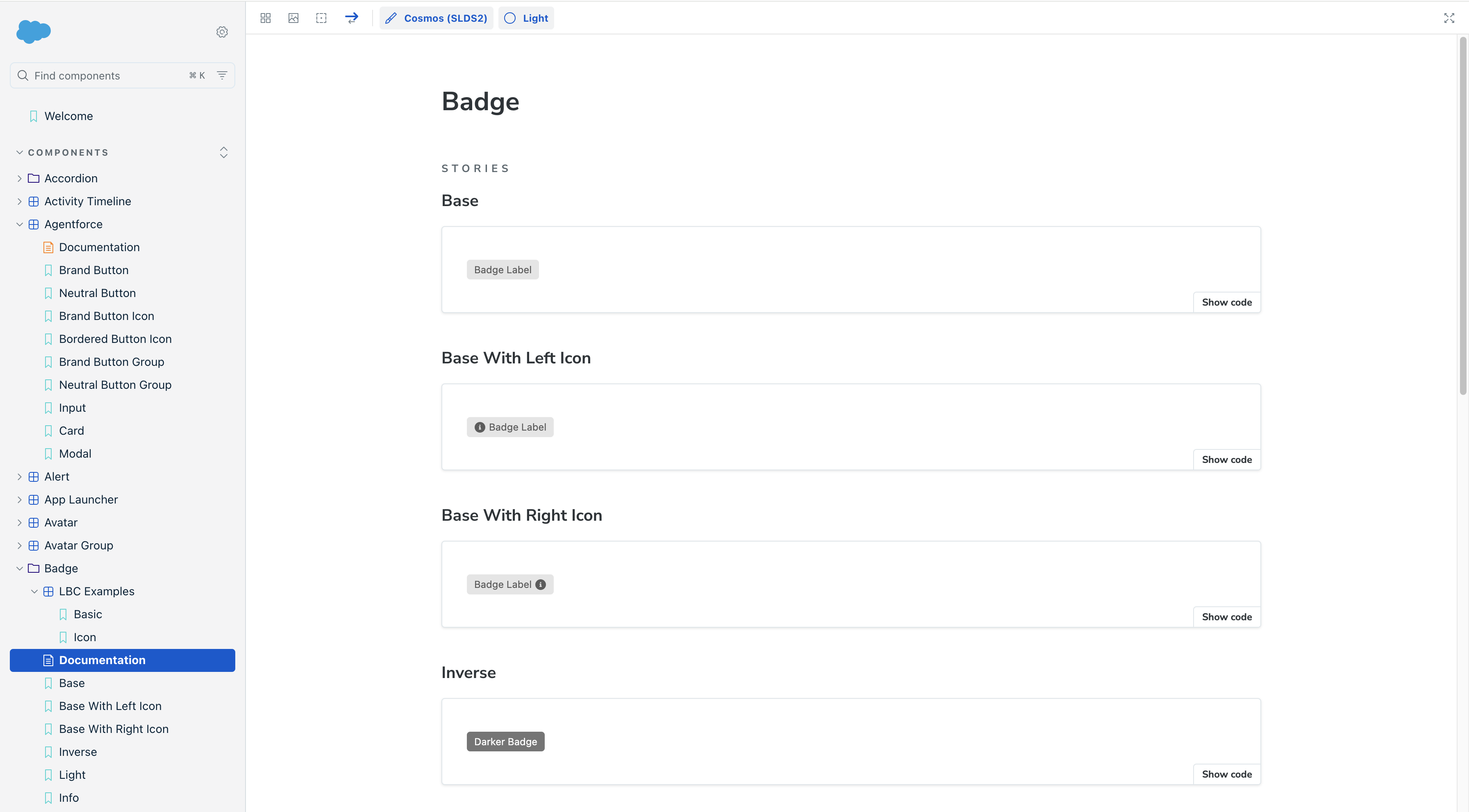
By the way, Salesforce also uses Storybook for documenting its SLDS2 components.
What is a Storybook?
It's an open-source tool to build, test, and document the components and pages in isolation for UI development.
You can create a set of stories, for example, where an individual story represents a component.
Each Story can have a documentation page where you typically put the considerations for using the component, its purpose, boundaries, a link to the Figma design, and examples.
For instance, let's say you have a radio button and a pick list. Designers recommend using the radio for up to three options and the pick list for more. Then, you add such information to the documentation.
Besides the documentation page, you have the story variants where you put different component variants, e.g., the base, brand, and inverse buttons.
The Storybook comes with a cool set of tools.
You can add controls to the Story so that developers and designers can toggle different options and observe how the component behaves in real-time.
You can also document the events that components emit, and developers can check those in the Actions tab.
Moreover, you can run the accessibility checks and expose the source code for developers to copy.
Storybook also supports visual regression testing.
Having such tests as part of the CI is extremely important for enterprise-level implementations.
It allows you to verify if any of the changes to the component library affect any of the UIs.
Unlike the unit and e2e tests, we compare image snapshots to identify any differences, which we then review and either approve or fix.
By default, it's powered by Chromatic, a paid tool built by the Storybook maintenance team.
But, you can also use custom implementations, e.g., with Playwright or Loki.
Another neat feature is that Storybook is extendable. It is possible to write plugins and extend the default functionality.
For example, you can improve the default search functionality to meet your needs or implement the media query breakpoints used in your organization.
Based on my experience, despite some downsides like build times, Storybook is a great tool.
Let's say we want to use it for managing the LWC library.
Here comes the challenge: LWC is not compatible with Storybook.
Lightning Web Components for Storybook
The Storybook doesn't support LWC by default.
LWC is just a web component at the end of the day, so it should work.
The problem lies in how we build Lightning Web Components.
The LWC framework is based on Rollup and utilizes @lwc/rollup-plugin to manage it.
Unlike LWC, Storybook for Web Components is powered by Vite.
I investigated the internet and asked fellow developers how to make it work.
For example, here are some of the examples that I found on GitHub, but those were 5 to 6 years old:
When I discussed that with one of my friends, he asked why I wouldn't create an app inside Salesforce where I would then render all the shared components I have with the documentation.
It's a valid question.
I know some enterprise companies that don't use Storybook, but rather have a custom web app to list all the components.
You can achieve a similar result in Salesforce, but should you include it as part of the metadata? What about the local environment?
I like the flexibility that Storybook provides. Moreover, Salesforce itself uses it, so there definitely should be a way.
Implementation
Note that I'm still at the beginning of the implementation, and the following is just a proof of concept.
Now that we know the issue is in the Rollup vs. Vite, we only need to find a way to resolve it.
The idea is that we need to configure the Rollup to build the LWCs as native components and then register them inside Storybook as custom elements in a different namespace to render.
I started by creating the LWC OSS project, which includes the LWC rollup plugin module for building web components.
The default Salesforce project doesn't include that, but you can install it there.
I used LWC OSS for a POC, but I plan to implement it for a real Salesforce project eventually.
Run the command npm init lwr@latest and proceed with the instructions.
Then, install the rollup plugin:
npm install --save-dev lwc rollup @lwc/rollup-plugin @rollup/plugin-replace
Let's say I have a Lightning Web Component called header in the modules/c directory.
The component is straightforward, and we only want to display the title and a message there.
import { LightningElement, api } from 'lwc';

export default class Header extends LightningElement {
 @api title = 'Hello World!';
 @api message = 'This is the header component.';
}
<template>
      <h1>{title}</h1>
      <p>{message}</p>
</template>
Then, we need to create a custom rollup config in the root directory. I named mine rollup.lwc.config.js.
import lwc from '@lwc/rollup-plugin';
import resolve from '@rollup/plugin-node-resolve';
import replace from '@rollup/plugin-replace';
import path from 'path';
import { fileURLToPath } from 'url';

const __dirname = path.dirname(fileURLToPath(import.meta.url));

const commonPlugins = [
  replace({
    'process.env.NODE_ENV': JSON.stringify('development'),
    preventAssignment: true
 }),
  resolve({
    preferBuiltins: false
 }),
  lwc({
    modules: [
 {
        dir: path.resolve(__dirname, 'src/modules')
 }
 ],
    outputConfig: {
      compat: false,
      resolveProxyCompat: false
 }
 })
];

export default ['header/header.js'].map(path => ({
  input: `src/modules/c/${path}`,
  output: {
    file: `dist/${path}`,
    format: 'es'
 },
  plugins: commonPlugins,
}));
The last export says Rollup to take the header component, compile it, and output to the dist folder.
Note: I added a header in the array, but you can dynamically read the list of component names inside the modules folder.
Alright, so we have configured the Rollup part, and if you run the npm run build:lwc, it will create a native component and output to the distribution folder.
Now, we need to install the Storybook in our project.
Run the following command and choose web components.
npm create storybook@latest
When you complete the install, you will have a new directory created for stories and a .storybook folder.
Let's create a story for a header component.
First, we need to make sure we register the LWC in the browser.
Let's create the utility functions to do so. Here is the lwc-utils file that has two functions:
registerLWCComponent that registers the component if we haven't registered it already.
isComponentRegistered that checks if we have already registered a component.
// Track registered components to avoid conflicts
const registeredComponents = new Set();

/**
 * Register an LWC component as a custom element only if not already registered
 * @param {string} tagName - The custom element tag name
 * @param {Function} Component - The LWC component class
 */
export function registerLWCComponent(tagName, Component) {
  try {
    // Check if already registered in our tracking
    if (registeredComponents.has(tagName)) {
      return;
    }

    // Check if already registered in custom elements registry
    if (customElements.get(tagName)) {
      registeredComponents.add(tagName);
      return;
    }

    customElements.define(tagName, Component.CustomElementConstructor);
    registeredComponents.add(tagName);
  } catch (error) {
    console.error(`Failed to register ${tagName}:`, error);
    throw error;
  }
}
/**
 * Check if a component is already registered
 * @param {string} tagName - The custom element tag name
 * @returns {boolean} - Whether the component is registered
 */
export function isComponentRegistered(tagName) {
  return registeredComponents.has(tagName) || !!customElements.get(tagName);
}
Note: You can take the custom element constructor from LWC via the CustomElementConstructor property.
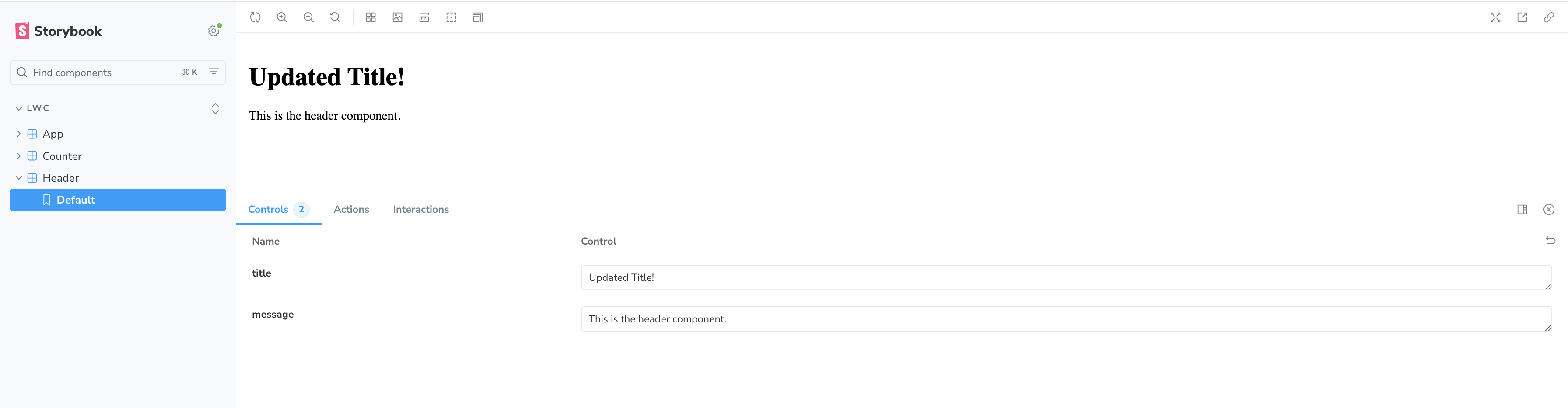
Then, you need to create the Header.stories.js file.
Note: You need to import the component from the dist folder.
import { html } from 'lit';
import HeaderComponent from '../../dist/header/header.js';
import { registerLWCComponent, isComponentRegistered } from './lwc-utils.js';

// Register the internal LWC component if not already registered
if (!isComponentRegistered('lwc-header')) {
  registerLWCComponent('lwc-header', HeaderComponent);
}

export default {
  title: 'LWC/Header',
  tags: ['autodocs'],
  render: (args) => {
    return html`
 <lwc-header title="${args.title}" message="${args.message}"></lwc-header>
 `;
 },
argTypes: {
    title: { control: 'text', description: 'Title to display in the header' },
    message: { control: 'text', description: 'Message to display in the header' },
 },
  args: {
    title: 'Hello World!',
    message: 'This is the header component.',
 },
};

export const Default = {
  args: {},
};
Here, we register the header component as the lwc-header element if it hasn't been registered yet. We also define the argument types to expose them in Storybook controls and export a single default variant.
Voila! We have everything to render the LWC inside the Storybook.
Let's update the script in the package.json
"storybook": "npm run build:lwc && storybook dev -p 6006"
Now, run the npm run storybook command, and it will compile the Lightning Web Components and serve them inside Storybook.
Of course, it's a base use case, and it only serves a proof-of-concept purpose.
Conclusion
In this post, I touched upon the challenges when implementing enterprise-level customer-facing UIs in Salesforce.
As I mentioned, unfortunately, it's often overlooked, and the Salesforce industry generally lacks front-end developers.
As a result, most of the implementations are not ideal and suffer from poor developer experience.
The current POC is an attempt to resolve the issues and improve the way we build front-ends for Salesforce.
The main goals are to improve:
- developer experience
- communication between designers and developers
- end-user experience
- stakeholder communication
You can use this example to configure your LWC library, but I still need to address several challenges that I'll tackle in my free time.
Some of those are:
- Building better examples
- Including the
lightning-*components - Mocking Lightning Data Services
- Creating visual regression testing examples
So, plenty of work ahead.
If you have faced any of those challenges in your projects or are currently facing them, or even better, if you resolved them somehow, please reach out and let's have a chat.
I'm curious to hear what experience others have!

Nikita Verkhoshintcev
Senior Salesforce Technical Architect & Developer
I'm a senior Salesforce technical architect and developer, specializing in Experience Cloud, managed packages, and custom implementations with AWS and Heroku. I have extensive front-end engineering experience and have worked as an independent contractor since 2016. My goal is to build highly interactive, efficient, and reliable systems within the Salesforce platform. Typically, companies contact me when a complex implementation is required. I'm always open to collaboration, so please don't hesitate to reach out!

