
This series of articles is about building modern Salesforce web applications. In the first part, I was creating an Angular2 SPA within SF environment.
Shortly, what is a web application? It’s a client-side software application which runs in a browser. The modern web apps are single-page applications (SPA). Related to Wikipedia, it’s an app which fits on a single web page. The goal is to provide a user experience like that of a desktop application.
Why building Salesforce applications with JavaScript worth it?
Fewer limitations. Apex has limitations and doesn’t allow you to customize your app completely. With the front-end rendering, SF has almost no restrictions. There are still some CORS (cross-origin resource sharing) issues, which are avoidable.
User experience. The client-side rendering avoids unnecessary requests for a full page reload. It can repaint any part of the UI, and it also supports lazy loading sections on your application to save bandwidth & speed initial load. There is an interesting article with a short recap of the benefits of the front-end rendering.
Performance. Just in time compiling: modern browsers compile and execute highly-optimized JavaScript like a native code, so runtime performance is close to that of software written in C or C++. (Eric Elliot, Programming JavaScript Applications)
Data Visualization
Data visualization is a presentation of data in a pictorial or graphical format. A primary goal is to communicate information clearly and efficiently.
It becomes crucial in business. Effective data visualization helps users analyze and reason about data and evidence. Also, it makes complex data more accessible and understandable which is of particular importance when working with big data.
In this post, we will continue with the Angular2 application from the previous part. I am going to use D3 JavaScript library to enhance the user interface of our project.
Project
Let’s take a look what are we going to build today. You can find the final project on a GitHub.
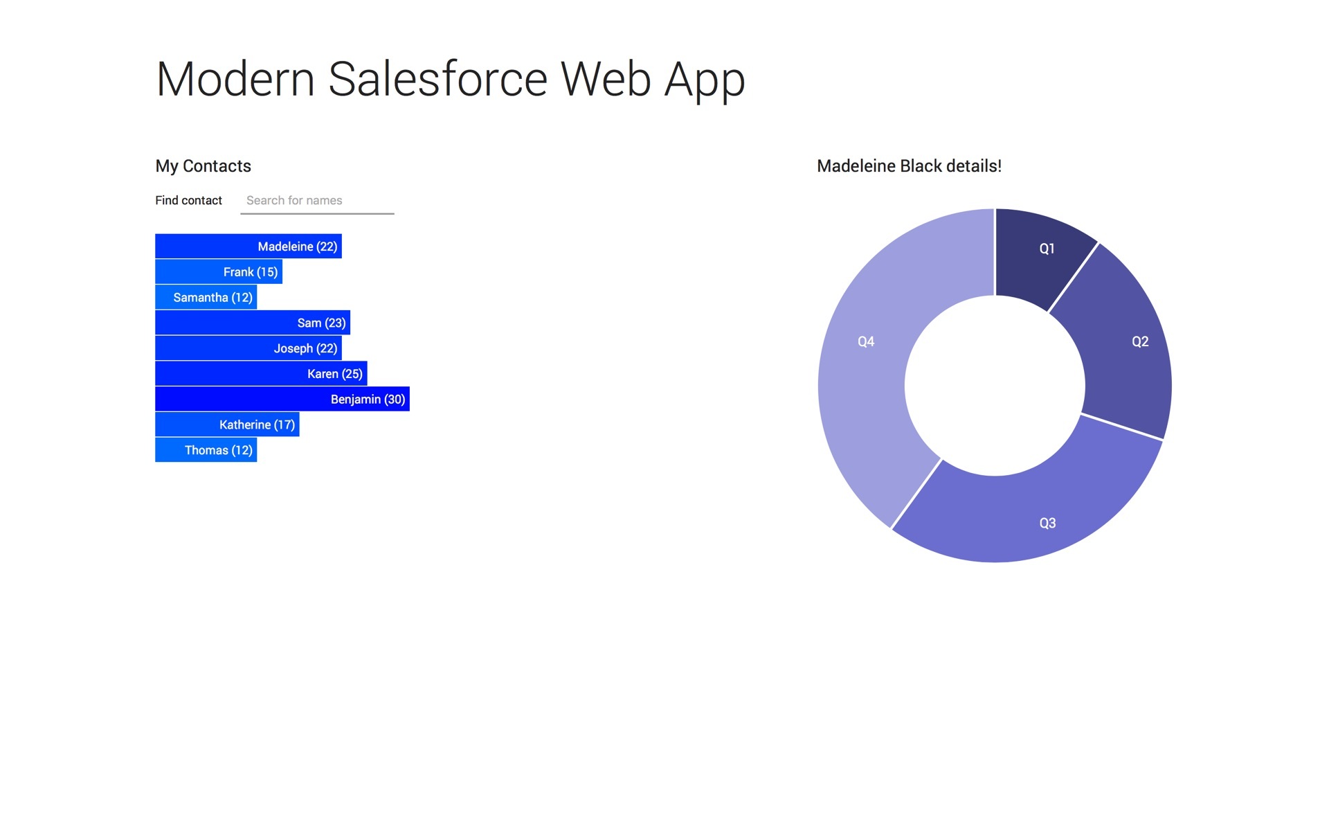
It is a simple single page application divided into two principal components.
On the left side, we have a list of our contacts, which we get from the Salesforce controller. Each contract has a certain amount of scores. The more scores he has, the longer the bar is, and the more intense blue color it will have. You can also filter contacts by using “Find a contact” input field.
On the right side, we have a pie chart representing the amount of sales of the chosen contact in each quarter. By clicking on the contact in the left section, the application will find and parse its CSV file, containing all required data and show it in the form of a pie chart.
D3.JS Library
Let’s take a short look at D3 library which stands for data-driven documents. D3 is a library that allows you to apply data-driven transformations to the document exposing the full capabilities of web standards such as HTML, CSS, and SVG.
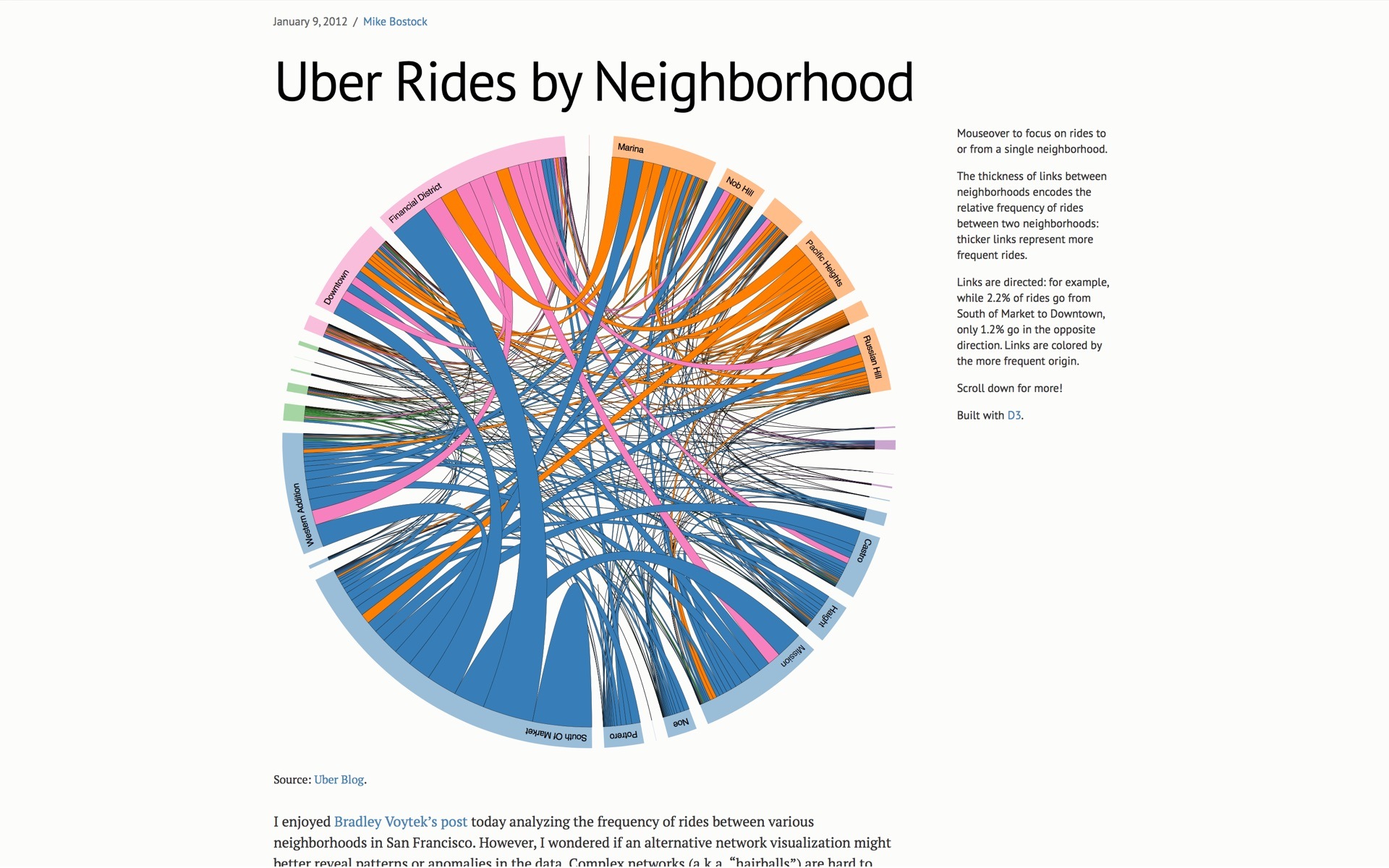
I suggest you visit its website; it has a decent collection of interesting use cases. Here is an excellent example of a chord diagram applied to the Uber data.
Update Data & Import Library
So, let’s start building our application further. Most of the things will happen on the front-end side, but we need to quickly update our apex controller by adding a new property called score to the contact class.
global class NgAppTest {
  global class Contact {
    public String name;
    public Integer id;
    public Integer score;
    public Contact(String name, Integer id, Integer score) {
      this.name = name;
      this.id = id;
      this.score = score;
    }
  }

  @RemoteAction
  webservice static String getContacts() {
    List contacts = new List();
    contacts.add(new Contact('Madeleine Black', 11, 22));
    contacts.add(new Contact('Frank Pullman', 12, 15));
    contacts.add(new Contact('Samantha Hill', 13, 12));
    contacts.add(new Contact('Sam Ince', 14, 23));
    contacts.add(new Contact('Joseph Hughes', 15, 22));
    contacts.add(new Contact('Karen Randall', 16, 25));
    contacts.add(new Contact('Benjamin Manning', 17, 30));
    contacts.add(new Contact('Katherine Wright', 18, 17));
    contacts.add(new Contact('Thomas Vance', 19, 12));
    return JSON.serialize(contacts);
  }
}
The next step is including the D3 library to our project. Since we are using NPM, we could type
npm install d3 --save
or use a hot link as
<script src=“https://d3js.org/d3.v4.min.js></script>
I will just add a script tag to the project, but D3 is written using ES2015 modules. You can import it to the component by writing:
import * as d3 from d3
As I’m using it as a global variable, I need to declare it for a TypeScript compiler inside the AppComponent.
declare let d3: any;
Now we have everything prepared and can start working on our first component.
Main Component
Firstly, we should update our template in a Component decorator by removing a list and adding an SVG element, which will hold a generated graph.
@Component({
  selector: 'app-root',
  template: `
    <div class="container">
      <h1>{{title}}</h1>
      <div class="grid">
        <div>
          <h2>My Contacts</h2>
          <div>
            <label>Find contact</label>
            <input [(ngModel)]="searchTerm" placeholder="Search for names">
          </div>
          <svg id="chart"></svg>
        </div>
        <contact-details [contact]="selectedContact"></contact-details>
      </div>
    </div>
  `,
})
Now it’s a time to draw our diagram. First of all, let’s define our variables.
let hue = 200, // Blue, will be used to dynamic color changes
    width = 420, // Width of an SVG container
    barHeight = 30, // Height of a bar
    index = 0, // Index used for transformations
    chart = d3.select("#chart")
      .attr("width", width)
      .attr("height", barHeight * this.contacts.length);
The last variable named chart would contain our SVG element. We are also applying width and height styles to it via attributes.
Notice that the height is dynamic depending on the number of contacts.
There are several ways to loop through our data to generate elements. In this component I will use native JavaScript’s Array.prototype.map() method. Our goal is to create a group element containing a rectangle bar and a label for each contact from our contacts array.
Place the following code in the map’s callback function.
this.contacts.map(contact => {
  // Code will go there
});
We need to create a container for the rectangle and the label, by appending it to the SVG element.
let group = chart.append("g")
  .attr("transform", `translate(0, ${index \* barHeight})`);
Notice, that we specify a transform attribute. Each group element will be moved down on the Y-axis by 30px multiplied by its index.Then, create and append the rectangle bar element.
group.append("rect")
  .attr("width", contact.score\*10)
  .attr("height", barHeight - 1)
  .style("fill", `hsl(${hue + contact.score*1.25},100%,50%)`);
The width of a bar is related to contact’s score. Height is equal to 29px to create a 1px gap between bar elements. The interesting part is fill, which also relates to a score amount. We are using HSL (hue saturation lightness) color model. It allows us to create smoother color transitions by updating hue value.
Now we need to add corresponding labels to our bars. They will have the name and the score amount.
group.append("text")
  .attr("x", contact.score*10-5)
  .attr("y", barHeight / 2 )
  .attr("dy", ".35em")
  .style("fill", "white")
  .style("font", `14px "Roboto"`)
  .style("text-anchor", "end")
  .text(`${contact.name.split(" ")[0]} (${contact.score})`);
Most of the parameters are self-descriptive. X is set to the bar width – 5px. Along with the text anchor attribute configured to end, we can align text element to the right.And finally, we need to increase the index by 1, so the next bar will appear below the existing one.
index++;
We can run all this code when our component has been initiated using Angular2 lifecycle hooks. To do so, import a ngOnInit and add it to the AppComponent class.
import { Component, OnInit } from ‘@angular/core';

@Component({…})
export class AppComponent implements OnInit {
  ngOnInit() {
    // Draw chart here
  }
}
It works perfectly, but there is a problem.
Adding Functionality
Our goal is to add a filtering functionality, so we could instantly filter our data and update the chart to make it more interactive. As D3 is not a part of Angular and we are not using ngFor directive, we can’t accomplish it via the standard ngFilter.
The next problem is that the ngOnInit hook runs only once. For our filter implementation, we need to update our chart every time we make changes. We need to redraw it by, firstly clearing the SVG, and then drawing it again.
Following the DRY (don’t repeat yourself) principles, if we need to run something at least twice, it’s a time for creating a method for that.Let’s write a draw() method for repainting the chart which will accept search term as a string value in it.
draw(searchTerm: string): void
  // Our previous code goes there
}
Now, we need to update a little bit the previous code. First of all, we need to clean the SVG before generating a new chart. Otherwise, it will paint new graphs on top of each other. We can do it simply by adding:
d3.selectAll("#chart > g”).remove();
It will remove all group elements from the SVG.Then we need to filter our data by leaving only these contacts which include search term in their name. To do that, add a native Array.prototype.filter() method in the chain before map().
this.contacts
  .filter(contact => {
    return contact.name.toLowerCase().includes(searchTerm.toLowerCase());
  })
  .map(contact => {…});
To draw our first chart when component initiates, we need to execute draw() method inside the ngOnInit hook.
ngOnInit() {
  this.draw('');
}
But how are we going to redraw it with the applied filter? In play comes the Angular event binding. To bind a DOM event we need to add its name into parentheses.
<input #search (keyup)="draw(search.value);" placeholder="Search for names" />
Now we have bound the draw() method to an input’s key up event. Every time the user types, it will redraw the graph with the applied filter.
We almost finished there. The last thing is how are we going to render a ContactDetailsComponent? In the first part, we did it throughout click event by passing a selected contact object to the child component. We don’t have rectangle elements in the template to bind an Angular event there. But what we can do, is to attach it via the D3 method called on().
Find our group element and bind an on click event to it.
let group = chart.append("g")
  .attr("transform", `translate(0, ${index * barHeight})`)
  .on("click", () => {
    this.onSelect(contact);
  });
The AppComponent is ready. It presents our data in a graphical format; we can filter it, and select a contact to see its details.
Before we start working on a child component, let’s add a ngIf directive to the element. I will explain this a little bit later.
Here is the final AppComponent’s code
import { Component, OnInit } from '@angular/core';
import { ContactDetailsComponent } from './contact-details/contact-details.component';
import { Contact } from "./contact";

declare let sforce: any;
declare let d3: any;

@Component({
  selector: 'app-root',
  template: `
    <div class="container">
      <h1>{{title}}</h1>
      <div class="grid">
        <div>
          <h2>My Contacts</h2>
          <div>
            <label>Find contact</label>
            <input #search (keyup)="draw(search.value);" placeholder="Search for names">
          </div>
          <svg id="chart"></svg>
        </div>
        <contact-details *ngIf="selectedContact" [contact]="selectedContact"></contact-details>
      </div>
    </div>
  `,
})
export class AppComponent implements OnInit {
  title: string = "Modern Salesforce Web App";
  contacts: Contact[] = JSON.parse(sforce.apex.execute("ngAppTest", "getContacts", {}));

  selectedContact: Contact;

  onSelect(contact: Contact): void {
    this.selectedContact = contact;
  }

  draw(searchTerm: string): void {
    // Clear SVG before drawing a new chart
    d3.selectAll("#chart > g").remove();
    let hue = 200,
        width = 420,
        barHeight = 30,
        index = 0,
        chart = d3.select("#chart")
          .attr("width", width)
          .attr("height", barHeight * this.contacts.length);

    this.contacts
      .filter(contact => {
        return contact.name.toLowerCase().includes(searchTerm.toLowerCase());
      })
      .map(contact => {
        let group = chart.append("g")
          .attr("transform", `translate(0, ${index * barHeight})`)
          .on("click", () => {
            this.onSelect(contact);
          });

        group.append("rect")
          .attr("width", contact.score\*10)
          .attr("height", barHeight - 1)
          .style("fill", `hsl(${hue + contact.score*1.25},100%,50%)`);

        group.append("text")
          .attr("x", contact.score*10-5)
          .attr("y", barHeight / 2 )
          .attr("dy", ".35em")
          .style("fill", "white")
          .style("font", `14px "Roboto"`)
          .style("text-anchor", "end")
          .text(`${contact.name.split(" ")[0]} (${contact.score})`);
        index++;
      });
  }

  ngOnInit() {
    this.draw('');
  }
}
Contract details component
Update a component’s template and leave there just a title and an SVG element with the id “details.”
@Component({
  selector: 'contact-details',
  template: `
    <div>
      <h2>{{contact.name}} details!</h2>
      <svg id="details"></svg>
    </div>
  `
})
Then also don’t forget to declare a d3 variable.
declare let d3: any;
The idea was to parse our data from the CSV file to build a contract details pie chart. We need to create a CSV file for each contact.
The name should be the same as an id of the contact. Each file should contain data about sales amount for every quarter. Here is an example for a Madeleine Black file.
// 11.csv
period,sales
Q1,11
Q2,22
Q3,33
Q4,44
We are going to store these files inside a Salesforce static resource bundle for the sake of simplicity. You can use standard SF attachments, CDN, etc.
Let’s ZIP all our files and upload them to the SF as a ContractDetails resource.
We need to know a path to this resource to access it from our application. We can reference it in a similar way as Angular templates.
Create a global variable within the Visual Force page called “resources” and declare it in the contact details component.
<script>
  var resources = {!URLFOR($Resource.ContactDetails)};
</script>
We will build a draw() method as well to create our pie chart. But before, let’s define what lifecycle hook are going to use. We need to paint our graph every time parent component is changing the @Input value. We obviously can’t use ngOnInit.
If you look at the documentation, you may notice a ngOnChanges hook, which states: “Respond when Angular (re)sets data-bound input properties. The method receives a SimpleChanges object of current and previous property values.”
Remember how we moved a ngIf directive from the child’s template to the parent’s? If we didn’t do that, the application would initiate a contactDetails component, and it would try to draw a graph. But since we haven’t sent a selectedContact object yet it would throw an error. Currently, DOM doesn’t have the contactDetails element until we set the selectedContact.
This hook is something that we were searching. Let’s import it into the component.
import { Component, Input, OnChanges } from '@angular/core';
…
export class ContactDetailsComponent implements OnChanges {
  …
  draw(): void {
    // Write your code there
  };
  ngOnChanges() {
    this.draw();
  }
}
As in the AppComponent, the first step will be cleaning the SVG.
d3.selectAll("#details > g”).remove();
Now we will define our configuration variables.
let width = 420,
    height = 420,
    radius = Math.min(width, height) / 2,
I’m setting radius as a Math.min in case if you would like to change either width or height. Pie chart should always fit the container, so it takes the least value. In our case, we could just divide the width by 2.
color = d3.scaleOrdinal(d3.schemeCategory20b),
Then I’m setting the default color scheme. You can use your own by passing color values in the form of an array, e.g. [‘#2ecc71’, ‘#3498db’, ‘#9b59b6’]. I’m using one of the standard D3 color schemes. You can find more information on a category scales in the official D3 documentation.
arc = d3.arc()
        .innerRadius(radius / 2)
        .outerRadius(radius),
      labelArc = d3.arc()
        .outerRadius(radius - 40)
        .innerRadius(radius - 40),
Predefined parameters for arcs and their labels. They are self-descriptive, labels will have a 40px offset.
pie = d3.pie()
  .sort(null)
  .value(function(d) {
    return d.sales;
  }),
This variable is an interesting one. It creates a new pie generator based on the given array of data. Please, check official documentation for the reference.
By default, the pie will sort our data by displaying the biggest value first. But we want to prevent that because we want to see the annual data in chronological order. That is why we are setting the sorting option as null.
Then I’m specifying that the pie’s value should be equal to the sales amount.
Notice, we are not passing any data yet, we are just configuring a constructor.
details = d3.select('#details')
            .attr('width', width)
            .attr('height', height)
            .append('g')
            .attr('transform', `translate(${width/2},${height/2})`);
Set the width and height of our SVG element and append a group container inside. The group will contain the pie chart and to centralize it inside the details we are using transform attribute. Otherwise, it would appear in the top left corner.
Once we have everything prepared, it’s time to parse the file and pass the actual data. To get and parse the CSV file you can use built-in d3.csv() method.
d3.csv(`${resources}/${this.contact.id}.csv`, (error, data) => {
  if (error) {
    throw error
  };
  // Proceed data here
}
The first parameter is a URL. We generate it by concatenating path to our static resource and using contact id as a name of the file.
D3 presents data as a JavaScript object. For instance, if you log the first contact data, you will get the following output:
[{period: "Q1", sales: "11"}, {period: "Q2", sales: "22"}, {period: "Q3", sales: "33"}, {period: "Q4", sales: "44"}]

let g = details.selectAll(".arc")
        .data(pie(data))
        .enter()
        .append("g")
        .attr("class", “arc");
By using the data() method we are building a new pie generator based on our previous configuration and array of data. Then we use enter() to create one element after another for every given data element in the array.
g.append("path")
      .attr("d", arc)
      .attr("stroke", "white")
      .attr("stroke-width", "3px")
      .style("fill", function(d) {
        return color(d.data.sales);
      })
      .on("mouseover", function() {
        d3.select(this).style("opacity", "0.8");
      })
      .on("mouseout", function() {
        d3.select(this).style("opacity", "1");
      });
D is an attribute generated by the arc along with the pie which defines a path to follow. We are also specifying strokes to add a small gap between our elements. Fill color is set based on the chosen scheme. And finally, we have added some hover effects to out pie elements. You could also display a helpful tooltip in a similar way.
The final step is to add our labels.
g.append("text")
      .attr("transform", function(d) { return "translate(" + labelArc.centroid(d) + ")"; })
      .attr("dy", ".35em")
      .attr("fill", "white")
      .text(function(d) { return d.data.period; });
Path.centroid() method returns a geometric centroid for a specified object. It’s quite useful for creating labels because it helps to allocate them inside different figures.
I set the Y-axis shift for vertical alignment, color to white, and text to the given data.
Final steps
Our application is ready for deployment to the Salesforce environment. To do so, just run
ng build --prod
and update generated main.bundle.js file in the static resources.Let’s check how the application is working.

Nikita Verkhoshintcev
Senior Salesforce Technical Architect & Developer
I'm a senior Salesforce technical architect and developer, specializing in Experience Cloud, managed packages, and custom implementations with AWS and Heroku. I have extensive front-end engineering experience and have worked as an independent contractor since 2016. My goal is to build highly interactive, efficient, and reliable systems within the Salesforce platform. Typically, companies contact me when a complex implementation is required. I'm always open to collaboration, so please don't hesitate to reach out!

