
Nowadays almost everybody had an online shopping experience. Buy products online is easy, it saves your time and is available 24/7. But not every online shopping experience goes smoothly.
Want to know how improve the shopping experience of your customers and increase conversions?
This post will be about four e-commerce usability problems which might affect your conversion rate. Learn how to fix them to prevent this from happening.
As examples, I’ve taken some famous Finnish online stores.
So let’s get started!
1. Poor system feedback
The first common e-commerce usability problem is a poor system feedback.
A well-designed system should always reflect user’s actions. It is called a feedback loop and consists of few steps.
- The user performs an action;
- Action has one or more effects;
- The most important effects are presented back to the user.
Building good and responsive feedback system is one of the most important parts of the user experience design process.
In my practice, the most common issue is “add to cart” button. Let’s check the following example. There is a screenshot from Isku online store.
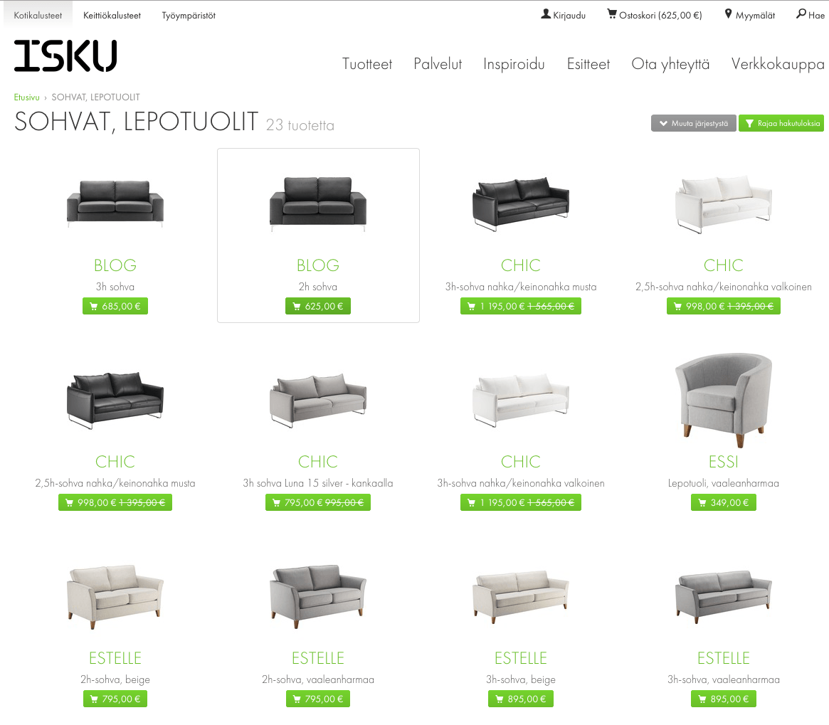
When the user clicks on a “buy” button, nothing happens.
This might be confusing for a user because he doesn’t know if his action had an effect.
You may notice that there is a cart in the header which was updated. For the user, it’s difficult to notice because he is currently looking at the product and “buy” button. This is an example of the poor system feedback and many other, especially, small stores have the same issue.
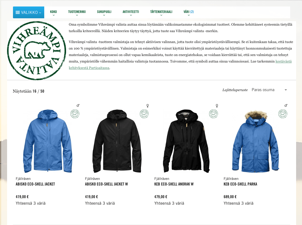
Let’s check another example, where this experience is done right. There are two screenshots from an online store Partioaitta.
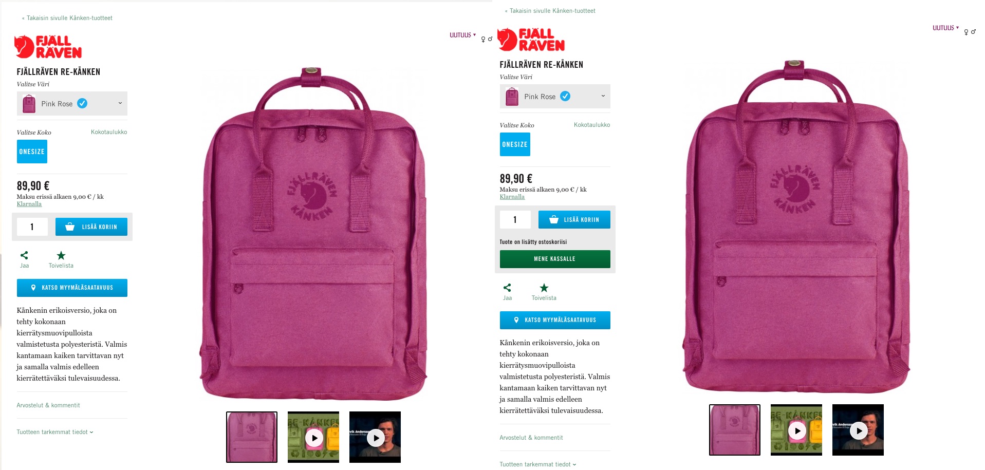
They’ve done really good job on that. Once the user clicks “add to card” he sees a loader on the button and gets a clear feedback: “The product was added to your cart”. And what is the most important thing, they guide the user and help him what to do next by providing clear call-to-action “go to checkout”.
Identify your basic feedback loops and try to improve them!
Error handling
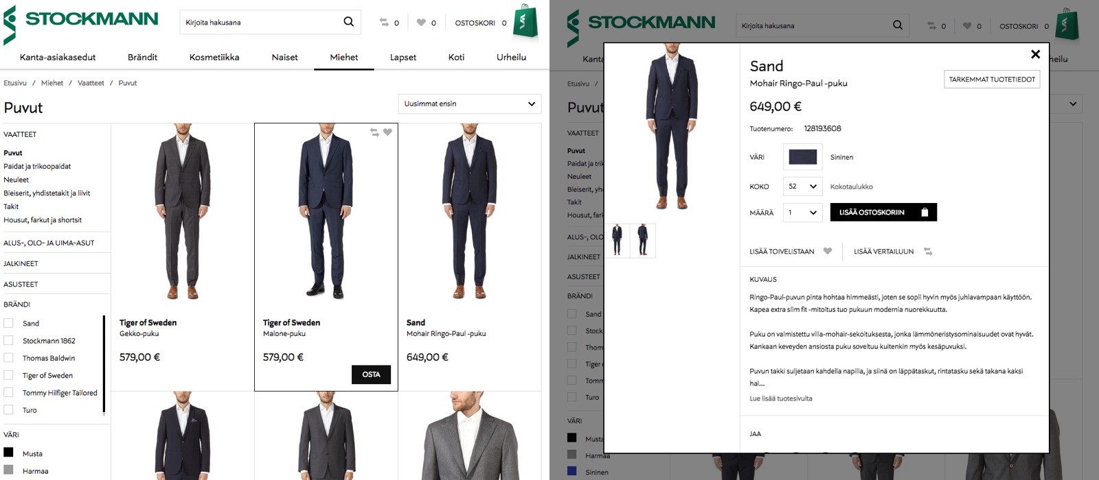
Error handling is another example of a system’s feedback, which is often done wrong. Stockmann is a famous Finnish store. Let’s check how they are handling errors in their online shop.
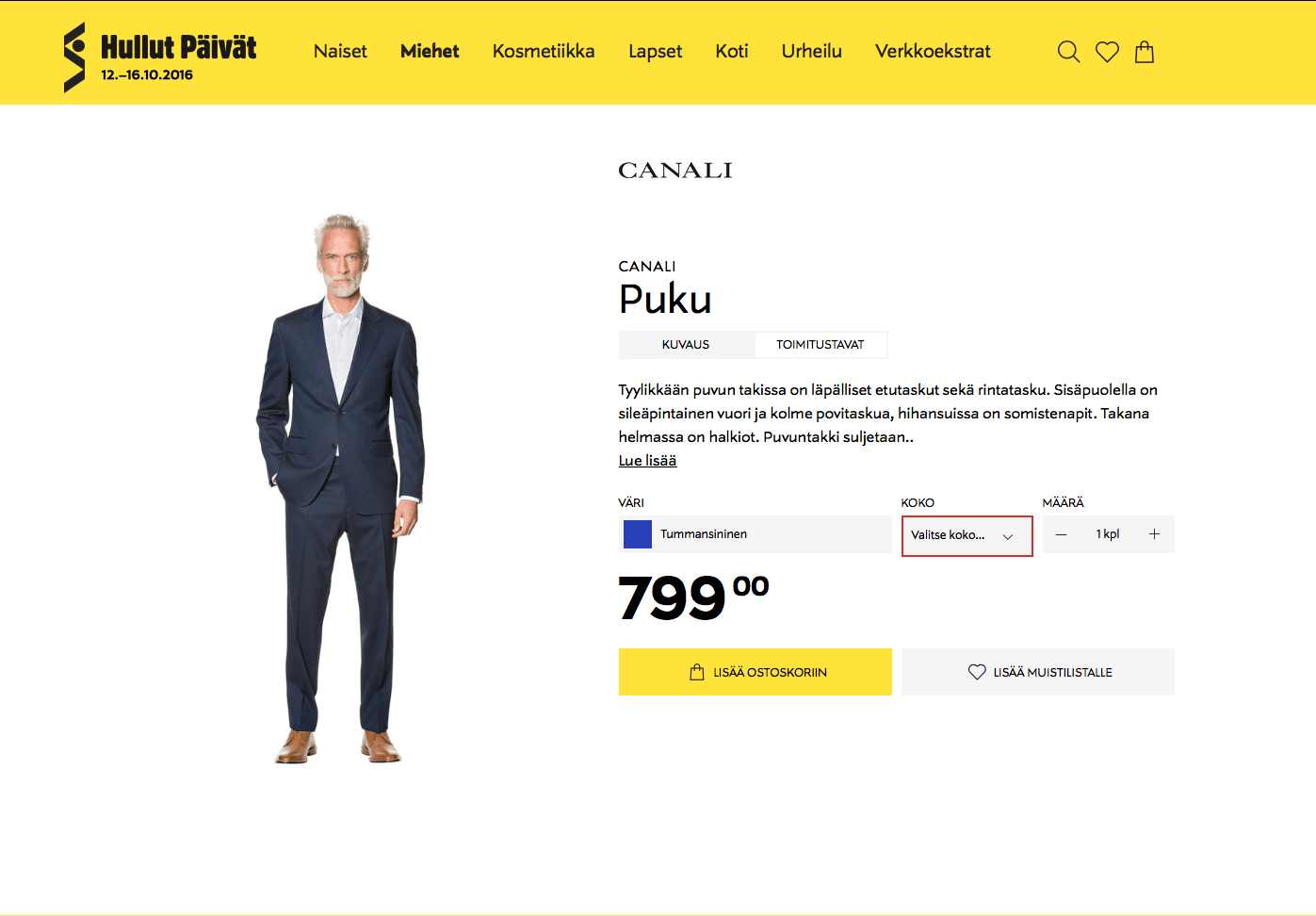
The user is trying to buy a product but again, nothing happens. You may notice that there is a red border around “size” dropdown but it’s not very helpful.
First of all, the user needs to switch focus from the main call-to-action to the dropdown to notice the error. Plus, there is no helpful error message, so the user doesn’t know what’s wrong.
You should always send helpful error messages to the user in the area where they’ve performed an action. The message should explain what happened and guide user what he should do to fix that issue.
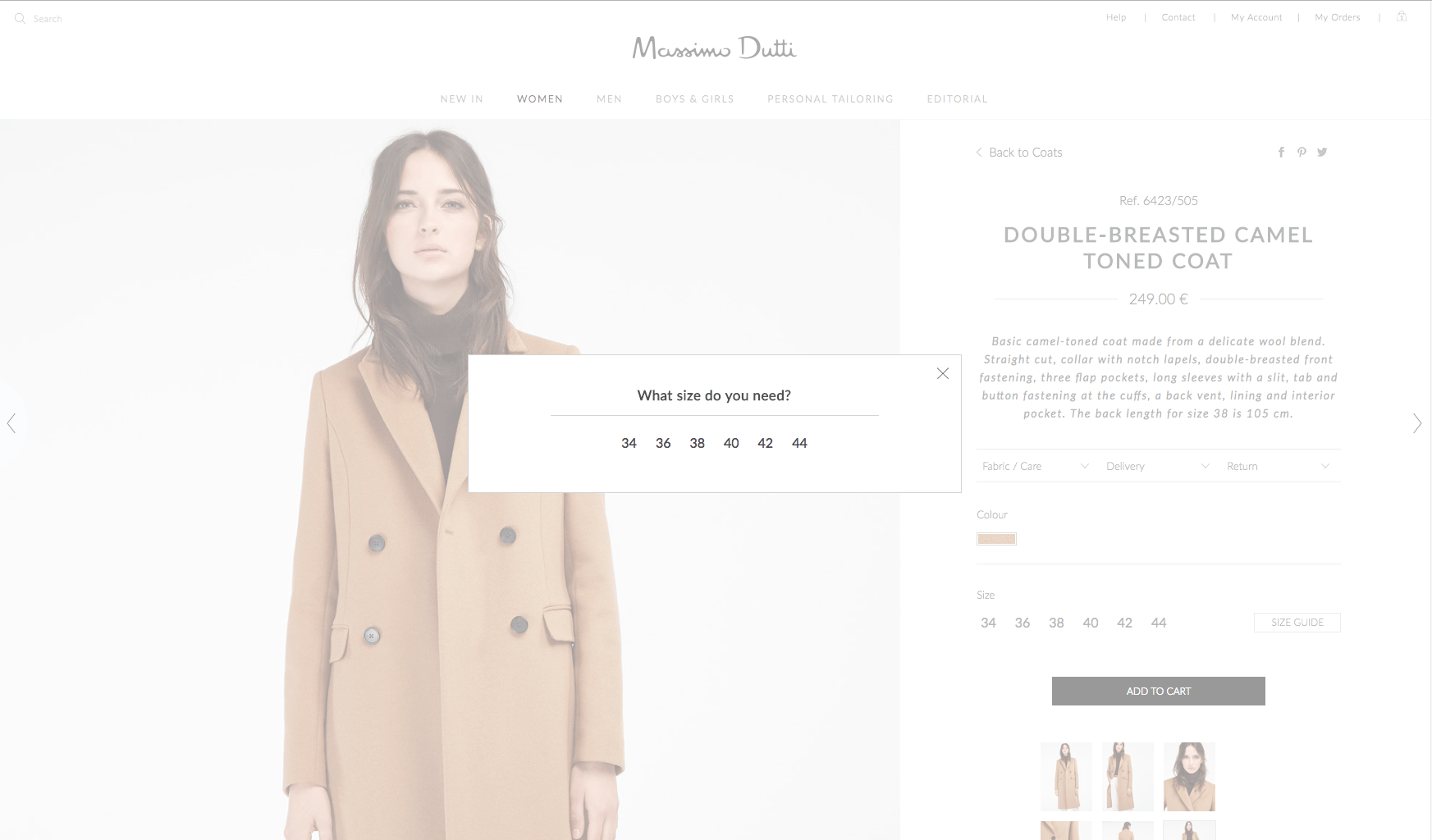
Here is a perfect example from Massimo Dutti. If the user forgets to choose the size, they don’t even show an error, so there is no either user’s or system’s fault at all. It’s definitely less painful and clearer for the user.
2. Call-to-actions
Problems with the call-to-action buttons are very common. The issue which I’m facing over and over again is missing of CTA.
There is a screenshot from Partioaitta.
The user can’t add anything to the cart from this page even he wants to.
It will take the user 3 clicks to buy a product and return back to this page:
- Open product;
- Add it to the cart;
- Return to the original page.
This could be done within one click.
Of course, in the case of the apparel store user needs to choose size and color. There is an example of how Stockmann handles that.
Another minor issue is the main call-to-action color.
Main CTA should stand out. Often the primary theme color is used, so call-to-actions look like all other elements. Especially, when the user has vision problems.
Below, you can find a screenshot from Verkkokauppa with Gaussian blur applied to simulate vision problems.
As you see, it’s not so easy to immediately find the buy button.
3. Search
Search is one of the most important experiences in the e-commerce. The great search helps users to find products easier. On the other side, the bad search may force users to leave the website because they can’t accomplish their goal.
Let’s start with the minor issue, an empty state. What should be presented to a user if there are no search results? Consider this page.
Not really helpful, right? I don’t know what I have been looking for, probably I’ve made a mistake in my query. I need to look at the search bar to figure that out.
Are there really no results or website is just broken?
You should always think about the empty state. Tell the user what were supposed to be on this page, what he was searching for, and suggest what to do next. For instance, you may also suggest the most popular products to the user as an alternative.
Check this simple example from the Amazon.
You, as a user, see what you have been looking for. You see that there are no such products. Amazon is trying to help you by suggesting using more general terms and checking your spelling.
Facets and filters
Facets and filters are also really important, they help the user to narrow down the results. They’re especially important if you have a long list of products on a page.
Consider the phone book. It has the huge list of names and phone numbers. But all these names are in alphabetical order and you can jump to the certain letter which will significantly reduce the time needed for searching.
Good filters help users to find desired products faster.
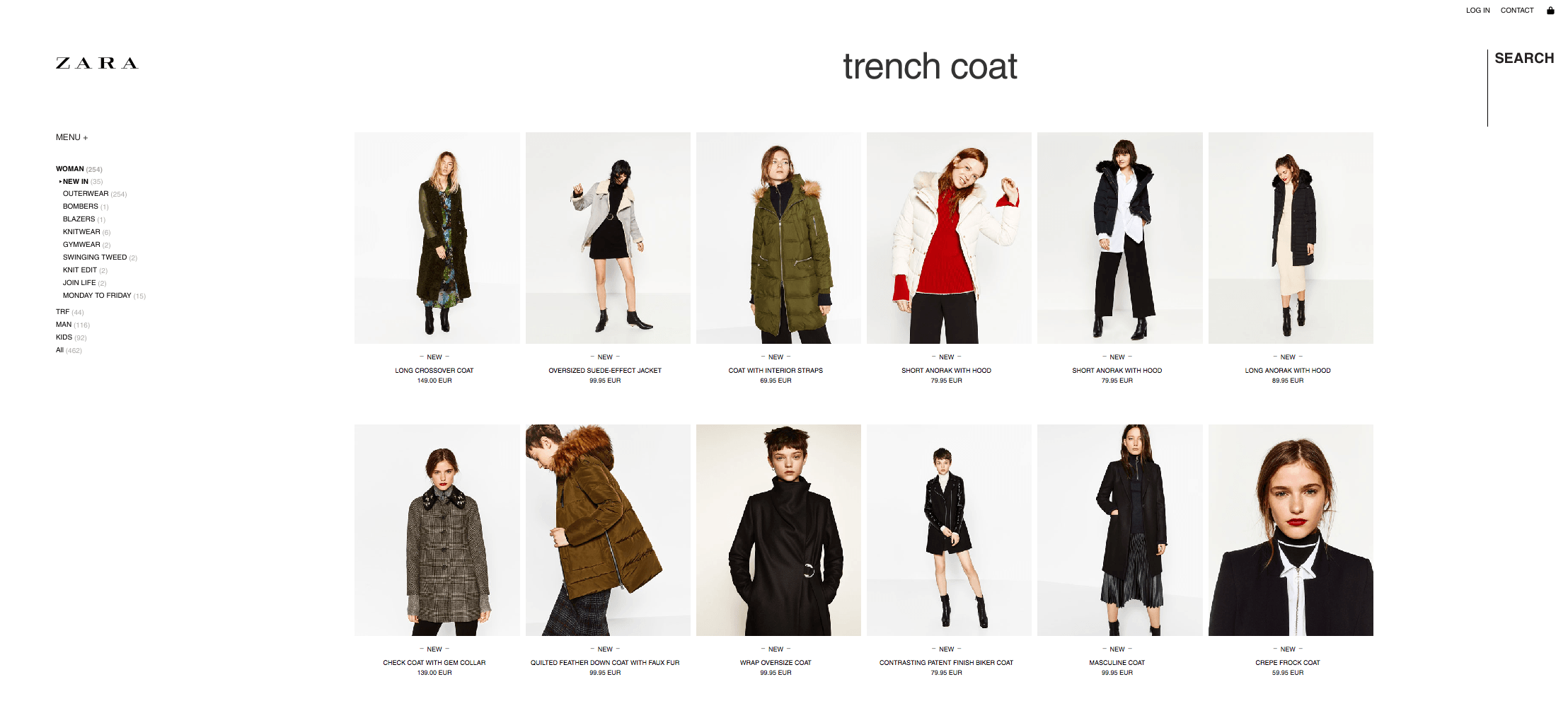
Zara isn’t doing well on helping users to browse their products.
Let’s return to Stockmann. They have plenty of useful filters on the left sidebar. Such as color, size and price.
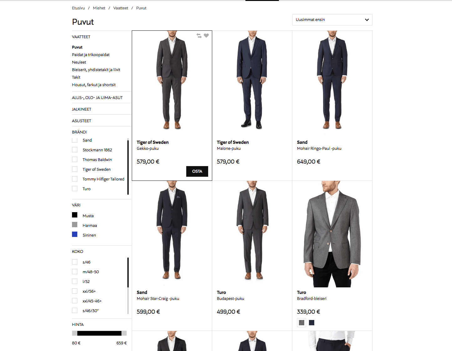
You should help your customers to find products as fast and easy as possible.
4. Checkout
When the user has added the desired product to the cart, not everything is done yet. The final step of the customer’s journey and your goal as a store owner is a purchase.
Bad checkout process may create barriers on the way of your users and increase the number of dropoffs.
Consider the following scenario. This is an example of how Isku creates an extra obstacle by requiring the user to register an account to continue.
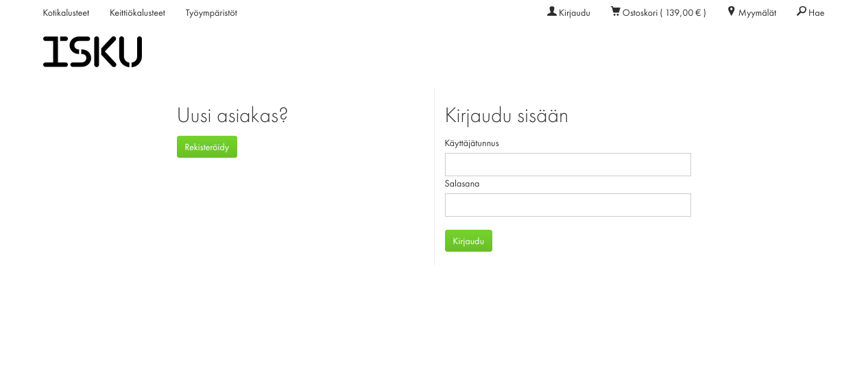
There are several possible solutions. It’s even better to ask the user to register an account at the end of the checkout process instead of the beginning. For the customer, it’s easier to leave the website when he hasn’t done much yet.
Nevertheless, the best option is to allow purchasing without registration.
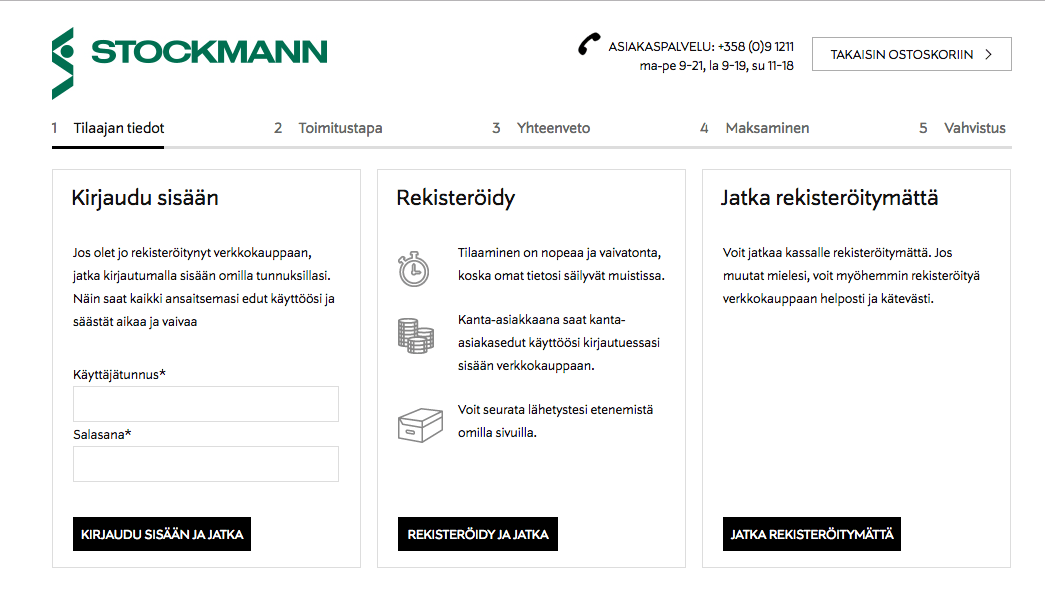
Stockmann has three options. You can either log in, register an account or proceed checkout without registration.
I hope you will get some useful ideas. Remember to provide the best possible shopping experience for your customers. That will help you increase your conversions.

Nikita Verkhoshintcev
Senior Salesforce Technical Architect & Developer
I'm a senior Salesforce technical architect and developer, specializing in Experience Cloud, managed packages, and custom implementations with AWS and Heroku. I have extensive front-end engineering experience and have worked as an independent contractor since 2016. My goal is to build highly interactive, efficient, and reliable systems within the Salesforce platform. Typically, companies contact me when a complex implementation is required. I'm always open to collaboration, so please don't hesitate to reach out!

